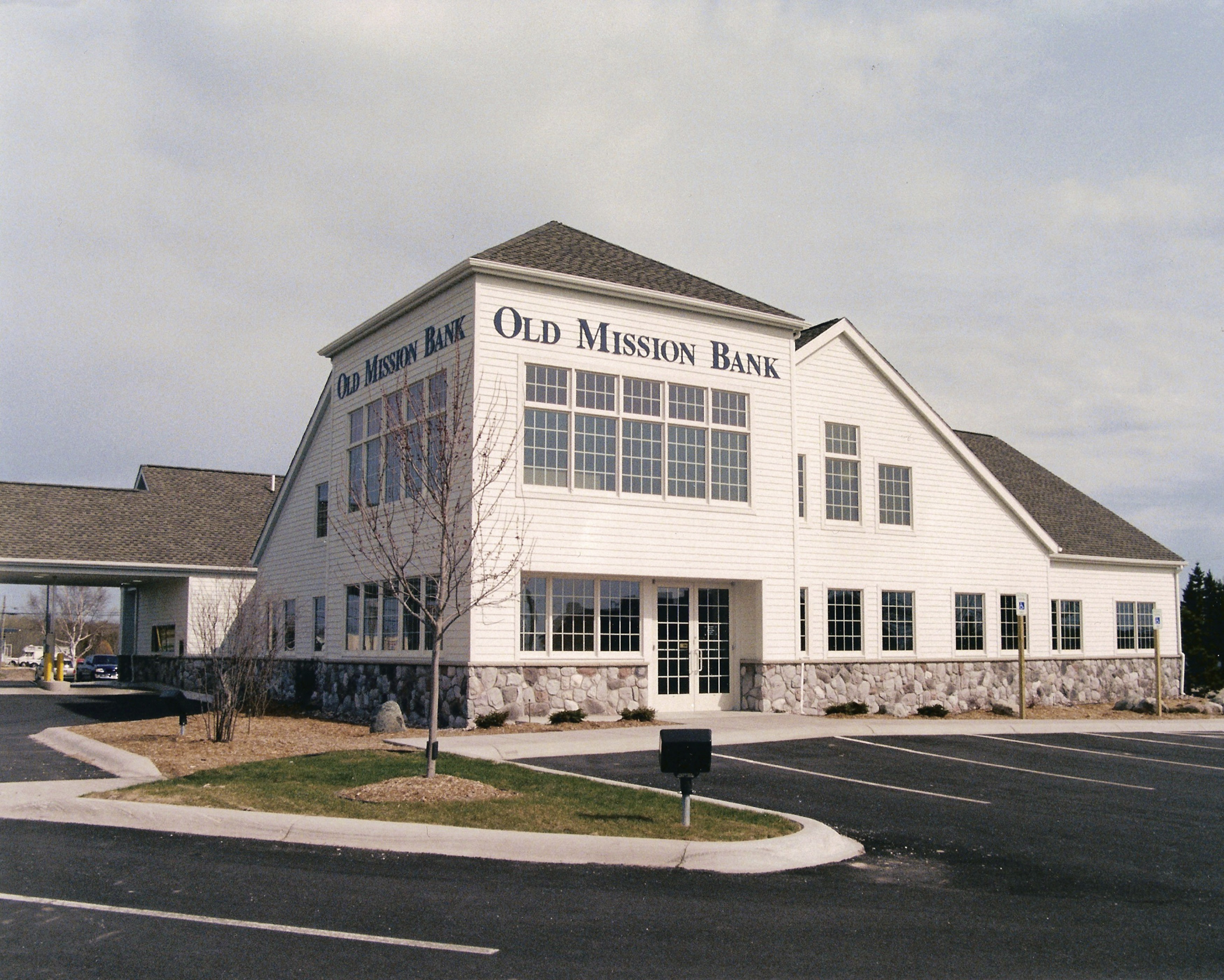
Old Mission Bank
The tower form on the corner of the building gave the new bank a strong image to attract attention in its community. The new bank’s name led the architects to create a traditional stone and wood clapboard structure reminiscent of early French mission structures of the area.
The challenge of planning for a new institution with no track record but with a good possibility of growth was met by planning for future growth in three ways: by allowing space for additional workstations in the 11,000 sq. ft. facility, by building unfinished space in the building’s lower level, and by planning for a matching future addition on the back.
Daniels and Zermack did the interior design and purchased all furnishings for the project.
